True Autumn Interiors: Warmth and Elegance of the Season
The True Autumn interior palette evokes the sensations of a leisurely stroll through an autumn forest, capturing the essence of rich, warm, and earthy tones.
Contents:
- Characteristics of True Autumn Interiors
- The Colour Palette
- Curated Palettes With Fusion Mineral Paint
- Key Colours for True Autumn Interiors
- Styling Tips for True Autumn Spaces
- Furniture Painting Tips For True Autumn Themes

Characteristics of True Autumn Interiors
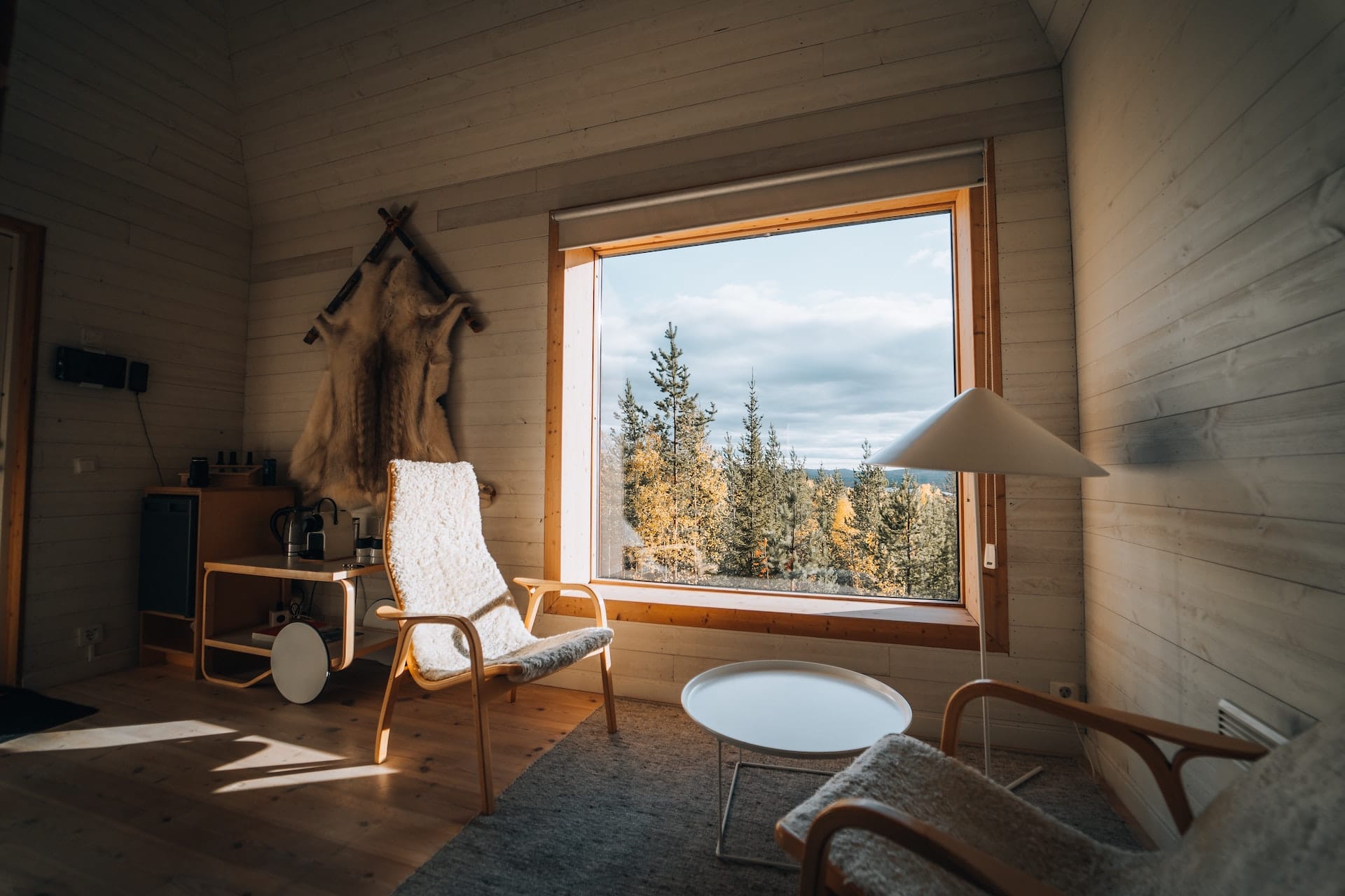
True Autumn interiors are characterised by their primary warmth and secondary muted tones. When you step into a True Autumn-inspired room, the first thing you’ll notice is the enveloping warmth that seems to radiate from every corner. The furnishings, wall colours, and decor all exude rich, golden undertones.
Moreover, the design elements in a True Autumn space are soft and muted, creating a harmonious blend rather than stark contrasts. This results in a medium contrast level, making the space feel cosy and inviting.

The Colour Palette
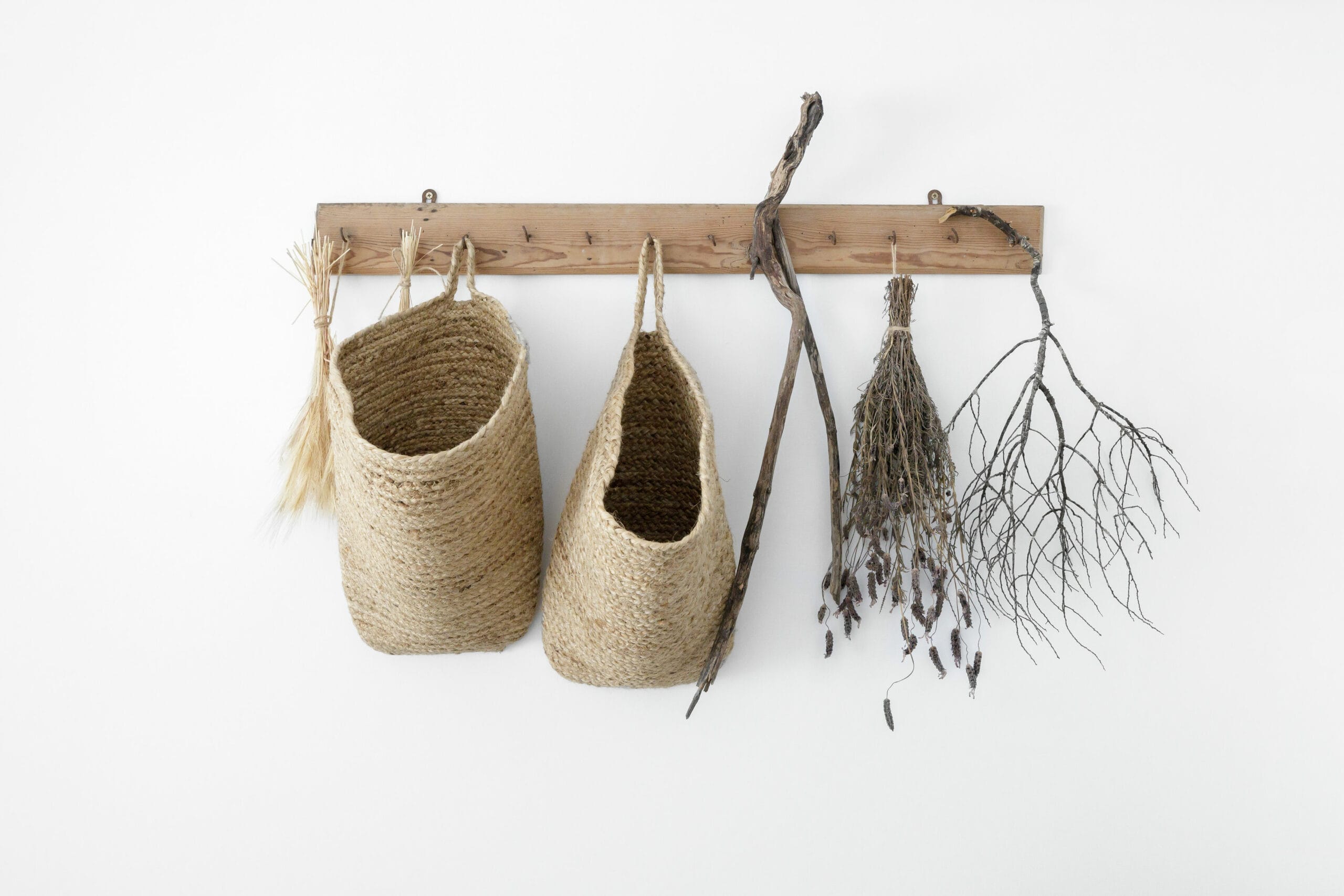
True Autumn interiors are reminiscent of the peak of the season, where golden canopies of trees stand proudly against a clear blue sky, and fallen leaves showcase their most exquisite shades of brown, orange, and yellow.
These hues are as rich and warm as golden wheat fields bathed in the glow of the setting sun.

Curated Palettes with Fusion Mineral Paint
Mixing colours with Fusion Mineral Paint is not just simple; it’s a doorway to endless creativity. I’ve lovingly crafted my favourite palettes for this season, ensuring each hue is mixed to perfection. For our adept furniture artists out there, I’ve meticulously detailed the percentage ratios for each blend, so you can replicate that ideal shade seamlessly. Every palette I’ve designed showcases three harmonious colours, two adaptable neutrals, and four striking accent shades. So, dive in, explore, and let your artistic spirit soar!

Key Colours for True Autumn Interiors:
- Eyes of the Room (Windows, Artwork): Opt for warm greens, golden yellows, and orangey-reds.
- Skin of the Room (Walls, Large Furnishings): Choose from a range of warm undertoned paints and fabrics. Think of beiges with a golden touch or deeper browns that give the room a bronzy or golden glow.
- Hair of the Room (Woodwork, Textiles): Incorporate rich wooden furniture pieces, from golden blonde woods to dark golden brown and even auburn-tinted woods.
- Contrast Elements: While the overall room should have a medium contrast, you can introduce elements that offer a slight contrast, like darker woods against lighter walls.

Styling Tips for True Autumn Spaces
- Neutrals: Instead of stark blacks, opt for dark browns or deep olive greens. For lighter neutrals, consider beige, cream, or ecru.
- Avoid: Stay away from overly bright and cool tones. Instead of pure whites, go for off-whites with a hint of warmth.
- Patterns & Prints: Choose patterns that echo the autumnal theme. Think of leaf motifs, wood grain textures, and oval shapes. Avoid overly geometric patterns; instead, embrace retro or organic patterns.
- Metals & Accessories: Gold, copper, brass, and bronze are your go-to metals. Consider using them in light fixtures, handles, and decorative items. Amber can be a great addition in the form of vases or decorative bowls.

Furniture Painting Tips for True Autumn Themes
- Neutrals: When selecting your Fusion Mineral Paint, lean towards dark browns or deep olive greens instead of stark blacks. For a softer touch, shades like beige, cream, or ecru are perfect.
- Colors to Avoid: Bright and cool tones might not complement the True Autumn palette. Instead of pure whites, choose Fusion paints that offer off-whites with a warm undertone.
- Patterns & Prints: When considering stencils or detailing, opt for designs that resonate with the autumnal vibe. Leaf motifs, wood grain effects, or oval shapes can be striking. Steer clear of stark geometric designs; instead, think of vintage or nature-inspired patterns.
- Metals & Accessories: If you’re adding metallic touches or using metallic paints, gold, copper, brass, and bronze should be your top picks. For added flair, consider amber-toned knobs or handles, or even decorative elements like stenciled vases or bowls on your painted furniture.

By embracing the True Autumn interior palette, you can create spaces that are not only visually appealing but also exude warmth, comfort, and a touch of nature’s elegance.

Conquer YOUR DIGITAL MARKETING AND SUBSCRIBE TO THE PAINTPRENEUR® WEEKLY DROP
Stay connected with the latest trends, inspiration, and expert insights in the decorative furniture paint industry. Our weekly emails are packed with valuable content designed to empower and support your Paintpreneur® journey. It’s more than an email—it’s your secret weapon in the furniture paint industry!